

Article Figures & Tables
Figures
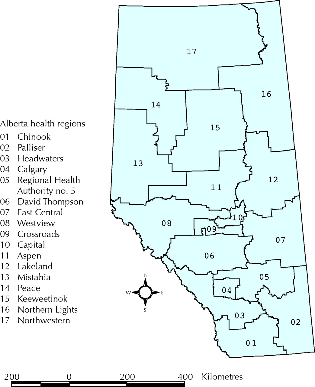
Fig. 1: Health regions in Alberta in 2002.
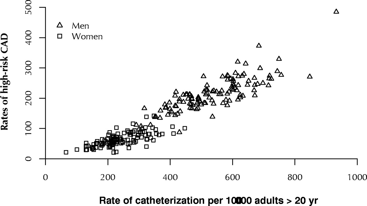
Fig. 2: Scatter plot of regional rates of high-risk coronary artery disease (CAD) versus rates of cardiac catheterization among men and women per 100 000 population over 20 years of age. Each health region is represented by 8 data points (1995–2002).
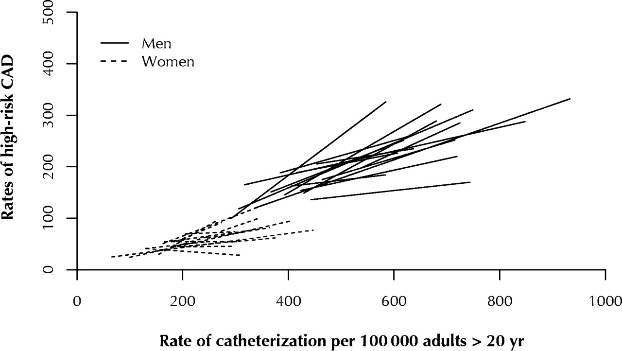
Fig. 3: Regression lines for each health region, derived from least squares linear regression analysis of rates of high-risk coronary artery disease (CAD) versus rates of cardiac catheterization per 100 000 population over 20 years. For each region, the plotted line spans the range of cardiac catheterization rates.
Fig. 4: Random slopes regression lines derived from hierarchical linear modelling using mixed-effects regression model. The 95% confidence intervals (dotted lines) reflect variability in the mixed-effects slopes. The plotted lines span the range of cardiac catheterization rates among men and women.

Tables
Table 1.


Article tools


Jump to section
Related Articles
Cited By...
More in this TOC Section
Similar Articles
Collections